Does your living room feel a little bland, or just not quite *you*?
The mood of your home is deeply influenced by its colors, so picking the right scheme is key.
1. Transform Your Space with Chic Wall Art and Neutral Accents
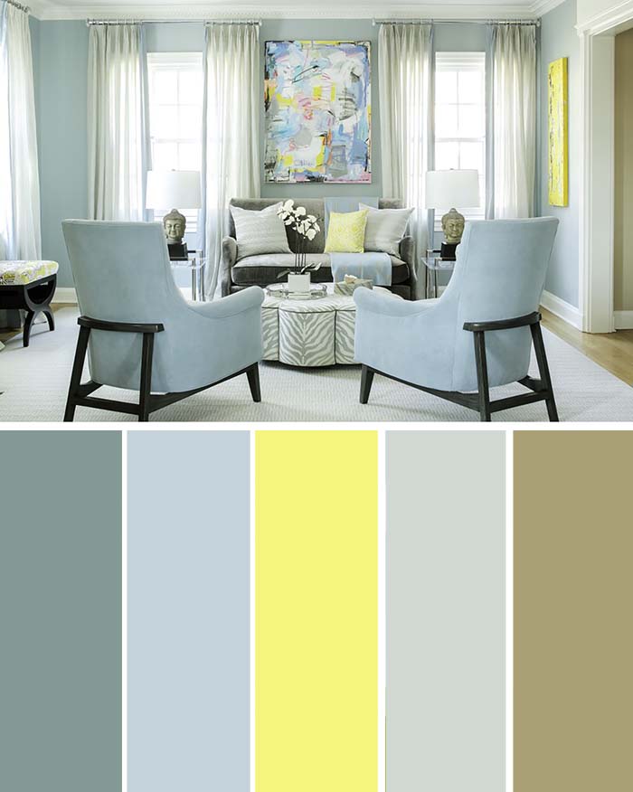
Bright lemon yellow accents from the wall art bring cheerful touches throughout the room. A neutral color scheme lets these accents stand out, setting a lively tone for conversation in this sunlit living area.
The armchairs look stylish and comfortable, and they do their job well.
2. Create a Fairy Tale Wonderland with a Living Room Palette

Even if you weren’t born into royalty in a faraway land, you can still bring your fairytale dreams to life by choosing the right colors. Try blending ethereal purples or pinks with calm contrasting shades.
Brown and beige tones keep the whimsical feel from becoming too much.
Throughout the space, soft, comfortable furniture adds a touch of elegance. But a two-panel canvas on the wall steals the show – it looks like a gateway to an imaginary world. This artwork becomes a clear focal point, drawing the eye and holding attention.
3. Brighten Up Your Space with Contrasting Accents

Deep colored walls or furniture create a strong contrast against white walls, giving a crisp, modern look. A wooden floor adds a vibrant touch and balances the room, with more color accents scattered throughout.
The softer shades of the walls, paneling, and carpet stay clearly separate from the deeper tones of the fireplace and furniture.
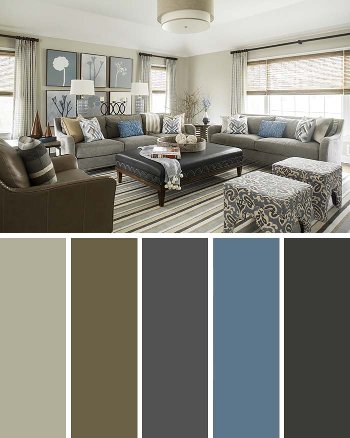
4. Find the Perfect Balance with Soft Earthy Colors
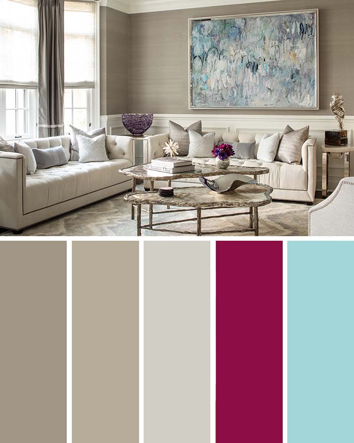
This room is filled with soft, natural colors: brown and beige. Entering it, you immediately feel a sense of calm and ease, enhanced by the plush, inviting furniture.
At the same time, the wainscoting, tall walls, and elegant table give the room a sense of stability and weight. Three elements balance it out: a large painting with soft pastels, a shiny glass bowl, and fresh flowers on the table.
5. Bring Vibrancy with Bright and Neutral Colors

Earlier, some homes used color as an accent effectively. This home, though, makes color the main feature – a big shift.
Pink, blue, and red are paired with more subdued tones, but they aren’t overwhelmed – each bright shade has its own presence in the room’s furniture and decor.
The blue sofa and red curtain are the main focal points, immediately catching your attention – unlike the earlier examples. This home feels sophisticated and confident, yet comfortable and genuine – like a lived-in space.
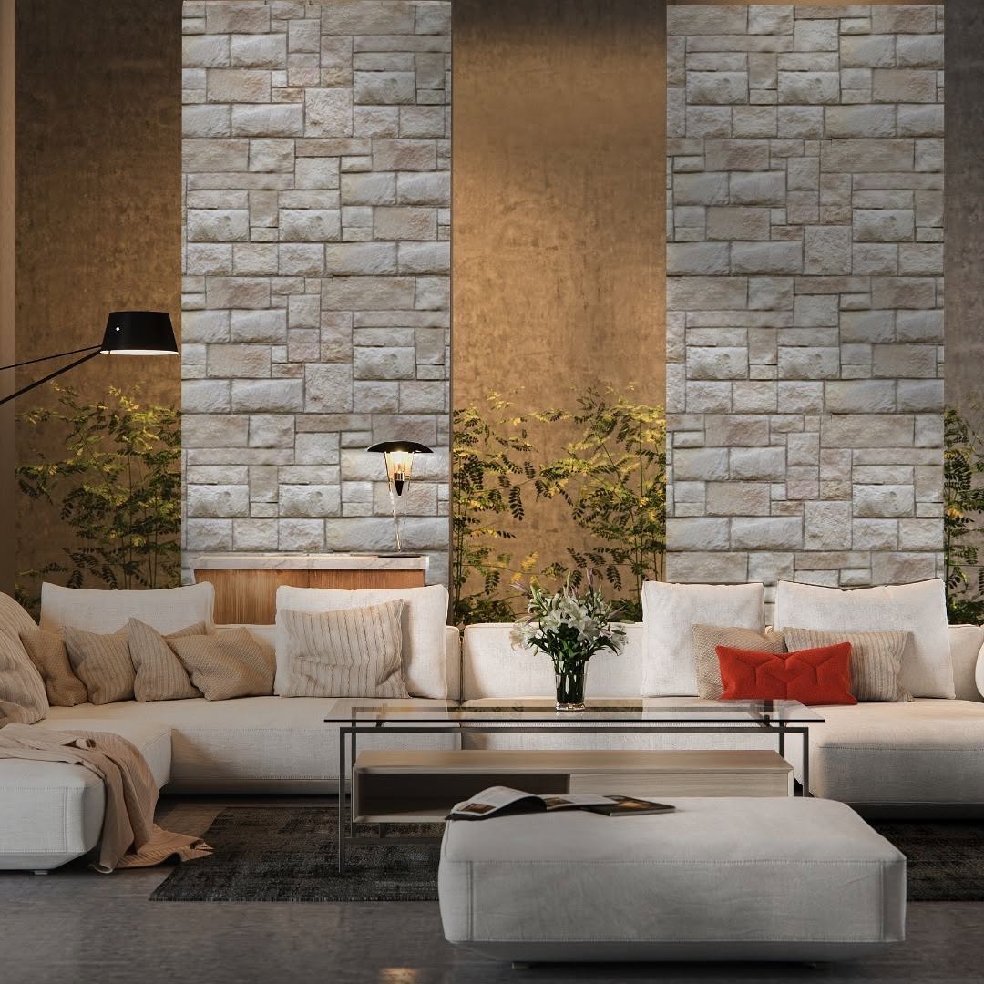
6. Accentuate Your White Decor with Neutral Color Furniture

This room uses a light color scheme to feel airy and pleasant. Different shades of gray are mixed together without matching perfectly, giving it an effortless look.
But precise details – like the matching red pillows – show the careful thought behind the design. It’s not a sleek, modern style, but it uses its unique qualities to create a more inviting atmosphere.
7. Make a Bold Statement with Coastal Colors

Bring the coast into your living room with colors that evoke summer warmth, a fresh ocean breeze, gentle waves, and seafoam. The design blends sophistication – seen in its unique shapes and Byzantine blue – with the simple charm of a beachfront bungalow.
The furniture uses lightweight, simple materials – no showiness at all.
Much of its impact comes from its elegant simplicity and the focused use of the color palette. Plus, coral pink adds a lovely contrast against the dominant blue tones.
8. Upgrade Your Home’s Aesthetic with Caramel
The caramel tones in this home evoke feelings of nostalgia and cherished memories, while also hinting at luxury. The space gets plenty of light, with walls reflecting it onto the deeper-toned surfaces.
Plenty of patterned pillows, a decorative rug, and various ornaments keep the room interesting without feeling chaotic.
The colors are closely tied to natural pigments. They seem to come alive in the sunlight streaming through the large windows, giving you the feeling of an autumn afternoon spent exploring nature.
9. Get the Look of Luxury Living with Patterned Accents
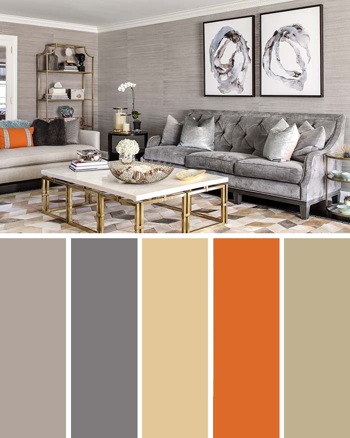
Gray, brown, and beige are easy on the eyes and mind, but sometimes you want a pop of color to keep things lively. Orange is in the same reddish family as brown, but its bright, eye-catching shade really grabs attention.
This room looks stylish and smart – it’s not too daring, but it feels inspired because it balances light, cheerful tones with deep, rich shades.
The orange is a playful reminder that a touch of boldness can improve a refined style, going beyond just earth tones. These impressive living room interior designs are the work of Karen Wolf Interiors.
More inspiration is available on their website if you’re interested.